
When you outsource your customer service to a professional call center such as The Connection®, you expect their agents to do a great job on behalf of your company and your customers. But how do you know if they are performing as promised? At The Connection®, we use a call center metrics dashboard tailored to each client.
Download our Sample Call Center Metrics Dashboard.
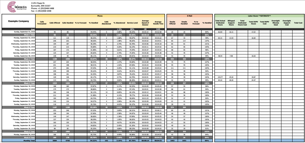
Our call center metrics dashboard shows day by day results as well as cumulative weekly and monthly totals, arranged on an easy-to-follow matrix. You can get into the weeds and study the details or you can also see the big picture at a glance regarding how we did (and, by extension, how you did). We share it with you regularly and go over it with you personally so we can answer any questions you may have.
Establishing Metrics That Matter to You
To create your dashboard, we discuss with you which measurements are most relevant for your business. In addition, there are some measurements we use for every client because they are industry standard and provide great benchmarks. Good examples of these are Average Speed to Answer and Call Abandon Rate. Today’s customers are impatient, and if you leave them hanging, they may leave you hanging, and we don’t want that!
We also establish key performance indicators (KPI) – numbers or percentages that identify the performance goals that we have agreed with you are important to meet. We measure data daily to get the greatest insight into trends that could influence forecasting decisions (for us, in managing your customer service, or for your company in making business decisions). As we study monthly results, we also look for anomalies in the data, with an eye toward understanding the cause.
Whatever the specific KPIs we use for your business, our call center metrics dashboard is jam-packed with useful, insightful data.
How the Dashboard Presents Data
Across the top of our matrix, we list each item to be measured, with corresponding KPI goals as appropriate.
Download a PDF version to get a better view of the report.
In our example you can see:
- Calls offered (incoming calls)
- Calls handled
- % handled
- Calls abandoned
- % abandoned (with KPI of <5%)
- Service level (with KPI of 80%)
- Average speed of answer (with KPI of :30 or less)
- Average handle time (from call answer go resolution)
We also track the volume of incoming emails and the number and percentage handled.
Down the left side of our matrix, there is a line for every day in the reporting month, with sub-sections for weekly totals and, of course, monthly totals that appear across the bottom line.
Interpreting the Data
In the world of answering and responding to contacts (voice, email, webchat), many KPI’s are interconnected. We separate the cause from the effect to ensure the correct decisions are made from a workforce perspective. That way, calls are handled within compliance and within the quality standards that are key to how we represent your company and your brand to your customers.
Access our Call Center Metrics walkthrough to get the full interpretation of this sample report.
See for Yourself
Listen to our Call Center Metrics Demo as Brad McNeive, one of our Program Managers, walks a client through a monthly report to demonstrate how it works. You will quickly see just how informative our call center metrics dashboard can be for your business.